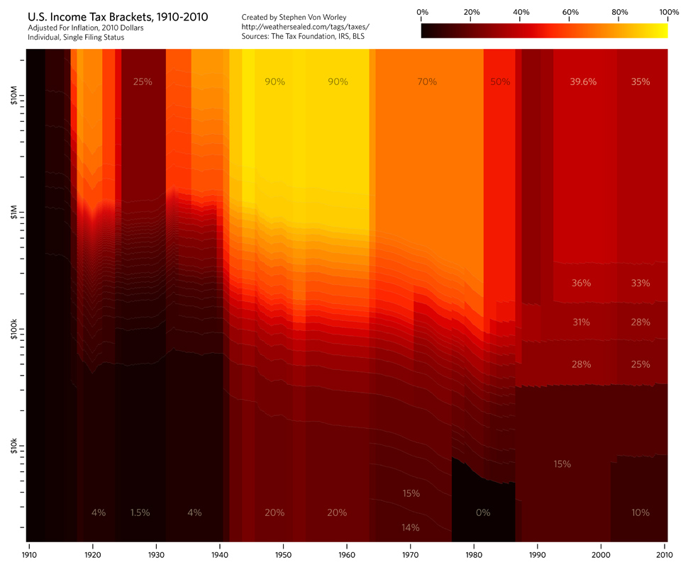
From Weather Sealed, a chart showing marginal tax rates from 1910 to the present.
To illustrate, Weather Sealed’s infographic team charted the historical U.S. income tax brackets for singles, adjusted for inflation, from 1910 to present. The colors indicate the marginal tax rate: black for low, red in the middle, and yellow for high. The horizontal axis is the tax year, and the vertical represents taxable income, log-scale, normalized to 2010 dollars with the Bureau Of Labor Statistics’ monthly CPI-U figures. The bracket data comes from The Tax Foundation and the IRS, and the effects of Social Security, capital gains, AMT, and other tax varieties are not included.
The really is a great way to see how tax rates have been structured over the past century, and see how different moments changed the outlook. I\’d almost prefer if the horizontal scale was tied to the percent of the population, because it looks as though those higher tax rates affect substantially more of the population than they do*, but that would be even more distracting than the logarithmic scale. Regardless, this is a great tool to note the impact of the Reagan (1981) and Bush (2001) tax cuts visually.
* I will note that in 2004, only 5% of U.S. households made more than $157,176.


