
Spotify is a pretty decent service. For free, you can listen to practically anything that’s ever been released commercially (sadly, no RVIVR, but that’s on them because they’re UP THE PUNX), as long as you’re willing to listen to some ads once in a while.
And I’m not against listening to ads once in a while.
The problem is, for a tech company with so much data, they use it horribly. Or they don’t use it at all. You’ll be listening to a sweet Biber partita, and get thrown a massively loud advertisement for ADVANCED AUTO PARTS. Listening to Old Crow Medicine Show? How about you try listening to LIL WAYNE’S NEW HIT ALBUM?
The worst, though, listening to something classy at work or church or school? How about TROJAN MAN?
Look, the first thing you can do is have a setting for (N)SFW ads. The second is, while a little harder, make the ads less annoying, by paying attention to what I listen to. This shouldn’t be difficult: I’m always looking for new music!
Now, you’re probably thinking: You know, you could just pay for it and get rid of the ads. Well, I’m not going to pay for this, and the annoying ads are part of the reason. I’m not going to incentivize you to annoy me into submission. Second, give me a decent product to go with your decent service. The application is a piece of fucking shit.
What do you think happens when you click on this red X?
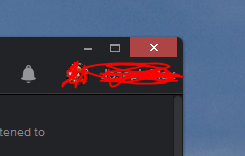
If you guessed “act like every other Windows* program” you’re wrong. Pretty much all programs act the same way when you click the red X: It quits the application. Not so for Spotify! No, it just minimizes the player. Seriously. You’re like “I need to stop the player from playing, let me click the quit program button” and Spotify says “Fuck you, you can’t quit me” and you go “I WISH I KNEW HOW TO QUIT YOU!”
Because you actually have to go to the menu and select “Exit.” And the menu is fucking thin and impossible to click on correctly:
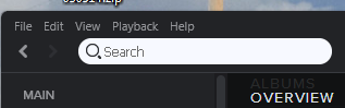
The rest of the UI is spacious (in fact, most of it since last week’s redesign is wasted space).
What about when you click the play/pause button—do you think clicking it does what you expect? Well, about half the time. Because, yes, back to ads, if there’s a display ad, you have to click twice. Why? I have no fucking clue. Probably to be like “Fuck you, there’s an ad here that’s more important to us than you.”
And speaking of that, the fucking turd of it all: When an audio ad plays, it you mute your computer or otherwise turn down the volume, the ad actually pauses.
So, Spotify, fix your shit. Make your application like all other programs. Make it actually work. I might pay.
Oh, and fix the shit where if two bands share a name, they get the same page, or if a band has a “the” for some reason there’s a page for it with and a page for it with out the “The.”
* All this is applicable to the OSX version of the player as well.


I agree With everything you wrote here, i was trying to search Spotify at google. but noooooo we won’t let you log in on Your user. i have a Premium, but I can’t log in With that eighter. i was so annoyed that i just wrote ( Spotify fucking piece of shit) where you search. i am annoyed to the max right now! and thanks for wroting this here